The Simulation tab allows the user to execute simulations for each of the scenarios specified for the study. The user may choose the number of simulations, whether to execute locally or on the Grid, and modify the random number seeds.
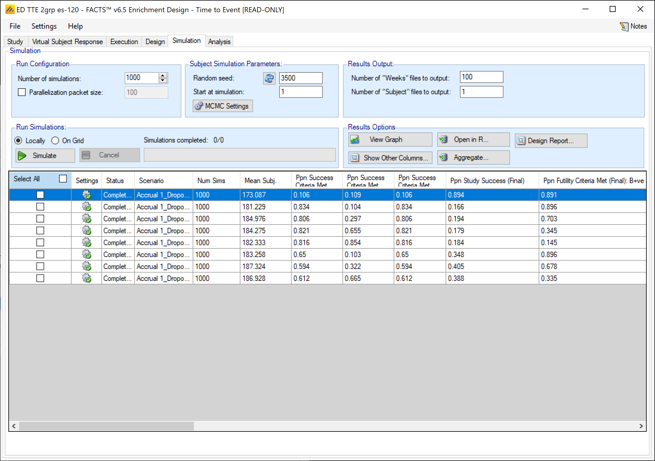
In the Simulation tab the user can provide simulation configuration parameters like the number of simulations to run, whether the simulations can be run on the Grid, the parallelization strategy, the random number seed used in the simulations, and the number of certain output files that should be kept during the simulation execution.
FACTS uses Markov Chain Monte Carlo (MCMC) methods in the generation of simulated patient response data and trial results. In order to exactly reproduce a statistical set of results, it is necessary to start the Markov Chain from an identical “Random Seed”. The initial random seed for FACTS simulations is set from the simulation tab, the first thing that FACTS does is to draw the random number seeds to use at the start of each simulation. It is possible to re-run a specific simulation, for example to have more detailed output files generated, by specifying ‘start at simulation’.
Simulation Options
Number of simulations
This box allows the user to enter the number of simulations that they would like FACTS to run for each scenario listed in the table at the bottom of the simulation tab. There is no set number of simulations that is always appropriate.
- 10 simulations
- You might want to run 10 simulations if you just want to look at a few simulated trials and assess how the decision rules work and if FACTS is simulating what you expected based on what you input on the previous tabs. If all 10 simulations of a ‘null’ scenario are successful, or all 10 simulations of what was intended to be an effective drug scenario are futile, it is likely there has been a mistake or misunderstanding in the specification of the scenarios or the final evaluation or early stopping criteria.
- 100 simulations
- You might want to run 100 simulations if you want to look at many individual trials to make sure that what you want to happen is nearly always happening. You can also start to get a very loose idea about operating characteristics like power based on 100 sims. 100 simulations is also usually sufficient to spot big problems with the data analysis such as poor model fits or significant bias in the posterior estimates.
- 1,000 simulations
- You might want to run 1,000 simulations if you want estimates of operating characteristics like power, sample size, and Type I error for internal use or while iterating the design. This generally isn’t considered enough simulations for something like a regulatory submission. With 1,000 simulations the standard error for a typical type I error calculation is on the order of \(0.005\).
- 10,000 simulations
- You might want to run 10,000 simulations per scenario if you are finalizing a design and are preparing a report. This is generally enough simulations for a regulatory submission, especially in non-null simulation scenarios. The standard error for a typical type I error calculation using 10,000 simulations is on the order of \(0.0015\).
- > 10,000
- You might want to run more than 10,000 simulations if you want to be very certain of an operating characteristic’s value - like Type I error. And plan to use the measurement of the quantity for something important like a regulatory submission. The standard error of a Type I error calculation with 100,000 simulations, e.g., is on the order of \(0.0005\).
- > 100,000
- You probably don’t want to run more than 100,000 simulations per scenario. Maybe your finger slipped an hit an extra 0, or you thought there were 5 zeroes in that number when there were actually 6. If the simulated trial is adaptive, this is going to take a while.
Each time the FACTS application opens, the “Number of Simulations” will be set to the number of simulations last run for this design. Not all scenarios must be run with the same number of simulations. If completed results are available, the actual number of simulations run for each scenario is reported in the ‘Num Sims’ column of the results table. The value displayed in the “Number of Simulations” control is the number of simulations that will be run if the user clicks on the ‘Simulate’ button.
Note also that if a scenario uses an external VSR file or directory of external files, the number of simulations will be rounded down to the nearest complete multiple of the number of VSR lines or external files. If the number of simulations requested is less than the number of VSR lines or external files, then just the requested number of simulations are run.
Start at Simulation
The “Start at simulation” option allows for the simulation of a particular trial seen in a previous set of simulations without having to simulate all of the previous trials in that previous set to get to it.
The initial random seed for FACTS simulations is set in the simulation tab. The first thing that FACTS does is to draw the random number seeds to use at the start of each simulation. Thus, it is possible to re-run a specific simulation out of a large set without re-running all of them. For example, say the 999th simulation out of a set displayed some unusual behavior, in order to understand why, one might want to see the individual interim analyses for that simulation (the “weeks” file), the sampled subject results for that simulation (the “Subjects” files) and possibly even the MCMC samples from the analyses in that simulation. You can save the .facts file with a slightly different name (to preserve the existing simulation results), then run 1 simulation of the specific scenario, specifying that the simulations start at simulation 999 and that at least 1 weeks file, 1 subjects file and the MCMC samples file (see the “MCMC settings” dialog) are output.
Parallelization Packet Size
The parallelization packet size option allows simulation jobs to be split into runs of no-more than the specified number of trials that are run in parallel. If more simulations of a scenario are requested than can be done in one packet, the simulations are broken into the requisite number of packets, run, and combined and summarized when they are all complete. The final results files will look just as though all the simulations were run as one job or packet.
The packet size must be a perfect divisor of the number of simulations. This is usually easy since common numbers of simulations are multiples of 100, but don’t try to use a prime number for Number of Simulations or you’re stuck with only 2 packet size options.
By default (if the check box with Choose Parallel Packet Size is not checked) the number of simulations per packet depends on the number of simulations per scenario. If the number of simulations is less than 1000, then each scenario is packaged as a single packed and simulated. If the number of simulations per scenario is greater than or equal to 1000, the default packet size is 10 and all simulations are decomposed into packets of size 10.
If an external file is used to create explicit VSRs (a .mvsr file), then the packet size should be a multiple of the number of rows in that MVSR file. Each packet will get passed the entire .mvsr file to run. If there are multiple .mvsr files with differing numbers of lines then only the VSR scenarios that have a .mvsr file that has a number of rows that is a divisor of the packet size will be run. The rest will error. The packet size can then be modified to get each of the .mvsr specified VSR files to be run.
Care should be taken when packetizing a scenario that includes an external data file to supply the virtual subject responses; in this situation, a of copy of the external file is included in each packet which can cause the packetisation process to run out of memory as the packets are being created. In this case, use a smaller number of larger packets, such as packets that are 1/10th of the total number of simulations.
When running simulations, FACTS will create and run as many packets in parallel as there are execution threads on the local machine. In general, the overhead of packetization is quite low, so a packet size of 10 to 100 can help speed up the overall simulation process. Threads used to simulate scenarios that finish quickly can pick up packets for scenarios that take longer. The progress bar updates as simulation packets complete, so the smaller the packet size, the more accurately FACTS can report the overall progress of the simulation execution.
Random Seed
Random number generation plays a huge role in FACTS’s virtual patient generation and statistical analyses. In order to exactly reproduce a statistical set of results, it is necessary to start the random number generation process from an identical “Random Seed”. Using the same random seed in the same version of FACTS guarantees that simulated trials will always be reproducible. Changing the design parameters or the version of FACTS may or may not remove this reproducibility depending on the change.
Even a small change in the random seed will produce very different simulation results.
In addition to setting the seed, the user can choose whether they want the “Same seed for all scenarios” or “Different seed” for different scenarios. If “Same seed for all scenarios” is selected, the subjects generated for each simulated trial will match for the different scenarios. This induces a correlation among the simulation output for different scenarios. This can be good if you’re trying to compare operating characteristics for different scenarios, but it can also be misleading. To disable this option select the “Different Seed” option. If “Different seed” is selected, then each scenario has its own seed that samples a different set of subjects than any other scenario. This uncorrelates the simulation output across scenarios, which can be advantageous if the absolute value of the operating characteristics are more valuable to you than the comparison of operating characteristics across scenarios.
MCMC Settings
To set advanced settings for simulation, the user may click the “MCMC Settings” button, which will display a number of additional specifiable parameters for simulation in a separate window.
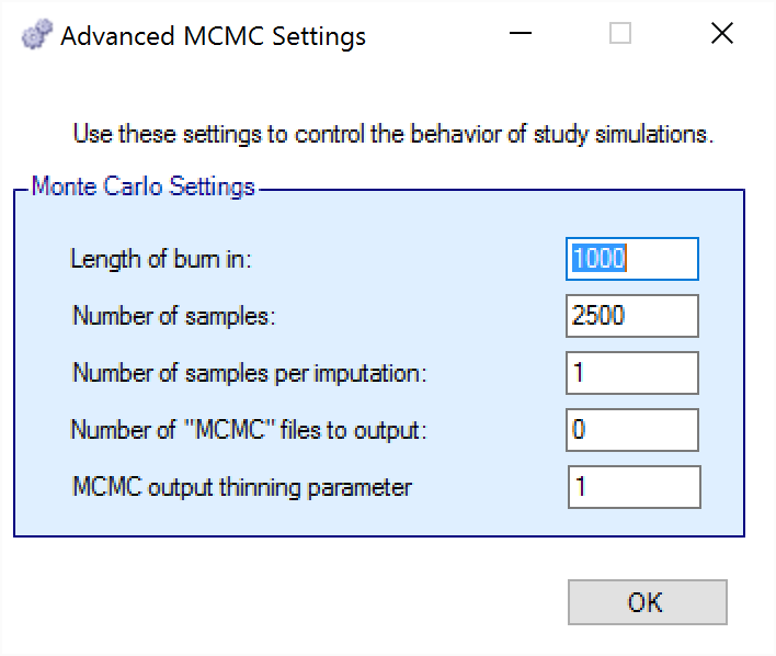
The first two values specify two standard MCMC parameters –
The length of burn-in is the number of the initial iterations whose results are discarded, to allow the MCMC chain to reach its stationary distribution. Burn-in samples are output in MCMC files if the files are output.
The number of samples is the number of subsequent iterations whose results are recorded in order to give posterior estimates of the values of interest.
The third parameter controls the number of MCMC samples taken after each imputation of missing data using the longitudinal model. The default value is 1. This parameter only has an effect if Bayesian imputation is being used to impute missing or partially observed data. Increasing the value of this parameter allows the parameter estimates to converge somewhat to a potentially new stationary distribution for each new set of imputed data. If the imputed data is only a small percentage of the overall data this is likely unnecessary. As a rough guide, if it at some early interims > 5% of the data being analyzed will be imputed, a value in the range 2 to 10 is recommended to avoid underestimating the uncertainty. A higher number should be used the greater the proportion of imputed data.
The next parameter concerns the output of the MCMC samples to a file. It is possible to have the design engine output the sampled values from the MCMC in all of the interims of the first N simulated trials of each scenario by specifying the “Number of MCMC files to output” to be greater than 0. The resulting files, ‘mcmcNNNN.csv’, will be in the results directory with all the other results files for that scenario. These files include the burn-in samples from the MCMC chains.
The final parameter in MCMC Settings is the thinning parameter. This parameter will only keep every \(N^{th}\) sample taken during MCMC where \(N\) is the thinning parameter. Thinning MCMC samples can reduce the autocorrelation of consecutive MCMC iterations, which increases the effective samples per retained sample, but also results in needing many more MCMC iterations to reach the same number of retained samples. Generally, we do not recommend thinning for standard simulation runs.
Unlike other software that performs MCMC, when you choose to thin by a value, FACTS does not increase the number of MCMC iterations it performs in order to retain the value specified in “Number of Samples”. So if you leave “Number of Samples” at its default value, \(2500\), and thin by \(10\), you will be left with \(250\) retained samples. You should adjust for this by increasing the “Number of Samples” if you choose to thin.
Results Output
The results output section of the Simulation tab allows for the specification of how many output files should be generated for files that are individually created for each simulation. Summary files (summary.csv) that have 1 line per scenario are always created. Simulations files (simulations.csv) that have 1 line per simulation are always created. Weeks files (weeksXXXXX.csv), patients files (patientsXXXXX.csv), and frequentist weeks files (weeks_freq_{missingness}_XXXXX.csv) are not created for every single simulation. Instead, the number of simulation specific output files can be set per type. This limits the amount of output files that FACTS will save.
See the endpoint specific descriptions of the output files for descriptions of what the previously mentioned output files report (continuous, dichotomous and time-to-event).
Some plots in FACTS that are created based on weeks files, and if very few weeks files are saved, the plots will not be as accurate or descriptive.
Run Simulations
Click in the check box in each of the rows corresponding the to the scenarios to be run. FACTS displays a row for each possible combination of the ‘profiles’ that have been specified: - baseline response, dose response, longitudinal response, accrual rate, and dropout rate. Or simply click on “Select All”.
Then click on the “Simulate” button.
During simulation, the user is prevented from modifying any parameters on any other tab of the application. This safeguard ensures that the simulation results reflect the parameters specified in the user interface.
When simulations are started, FACTS saves all the study parameters, and when the simulations are complete all the simulation results are saved in results files in a “_results” folder in the same directory as the “.facts” file. Within the “_results” folder there will be a sub-folder that holds the results for each scenario.
FACTS Grid Simulation Settings
A user with access to a computational grid may choose to run simulations on the grid instead of running them locally. This frees the user’s computer from the computationally intensive task of simulating so that they can continue other work or even shutdown their PC or laptop. In order to run simulations on the grid, it must first be configured. This is normally done via a configuration file supplied with the FACTS installation by the IT group responsible for the FACTS installation.
Simulation Results
In the center of the simulation tab, the summary simulation results are displayed. There are many columns of results, these are organized into related groups of sub-windows, which can be displayed by clicking on the “Show More Columns” button.
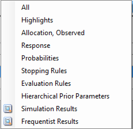
These windows will show:
| Name | Column Description |
|---|---|
| All | All summary columns |
| Highlights | Only the columns shown on the main tab |
| Allocation | The columns that report on participant recruitment and allocation |
| Response | The columns that report that estimate treatment response, the SD of the estimate, the estimate of the SD of the response, the true treatment response and the true SD of the response. |
| Probabilities | The final estimates for the QOIs that were computed for the trial. |
| Stopping Rules | The proportion of times the different stopping criteria were met |
| Evaluation Rules | The proportion of times the different final success/futility criteria were met. |
| Hierarchical Prior | Parameters the posterior estimates of the values of the parameters of the Hierarchical Prior models, if any were used. |
| Simulation Results | A window that displays the individual simulation results for the currently selected scenario. |
| Frequentist results | A window that displays the frequentist summary results. |
Right Click Menu
Clicking the Right-hand mouse button on a row in the simulations tab brings up a short cut menu:
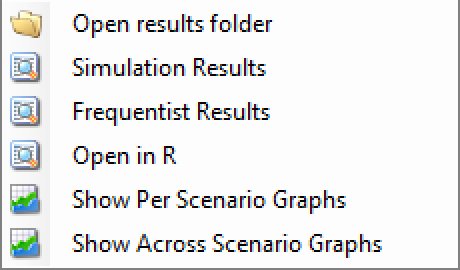
These will respectively:
Open a new Windows directory browser window showing the contents of the simulation results for that scenario.
Open a window that displays the individual simulation results for that scenario. The results initially displayed are the ‘highlights’ columns, similarly to the summary results (see below) the results columns are collected into sub-groups, windows of these subgroups can be opened from the Right Click menu of the Simulation Results highlights window.
Open a window that displays the frequentist analysis summary results. This option is only available if one or more frequentist analyses have been selected on the Design > Frequentist Analysis tab. (If more than one analysis has been requested – using different treatments of missing data there will be separate options in the menu to display each summary).
Open R loading in the result files for that scenario as separate dataframes.
Opens the FACTS graph control displaying the graphs for that scenario.
Opens the FACTS graph control that displays the trellis plot of graphs of selected scenarios for selected design variants.
Open in R
The “Open in R” button allows for the creation of an R script that has pre-populated code for loading in output files created by the FACTS simulations.
By default, any/all of the simulation output files can be included in the created script. If “Aggregation” (see below) has been performed, then only the aggregated files will be available for being loaded in R.
When the button is clicked, FACTS will create an R script with the correct file paths to load in the data, as well as creating a function that will read the files in correctly. The file is then opened in the default R editor for the user. If there is no default program for opening a .R file, your operating system should ask how you want to open the file.
Aggregation
Aggregation combines the csv output from multiple scenarios into fewer csv files. The Aggregate… button displays a dialog which allows the user to select what to aggregate.
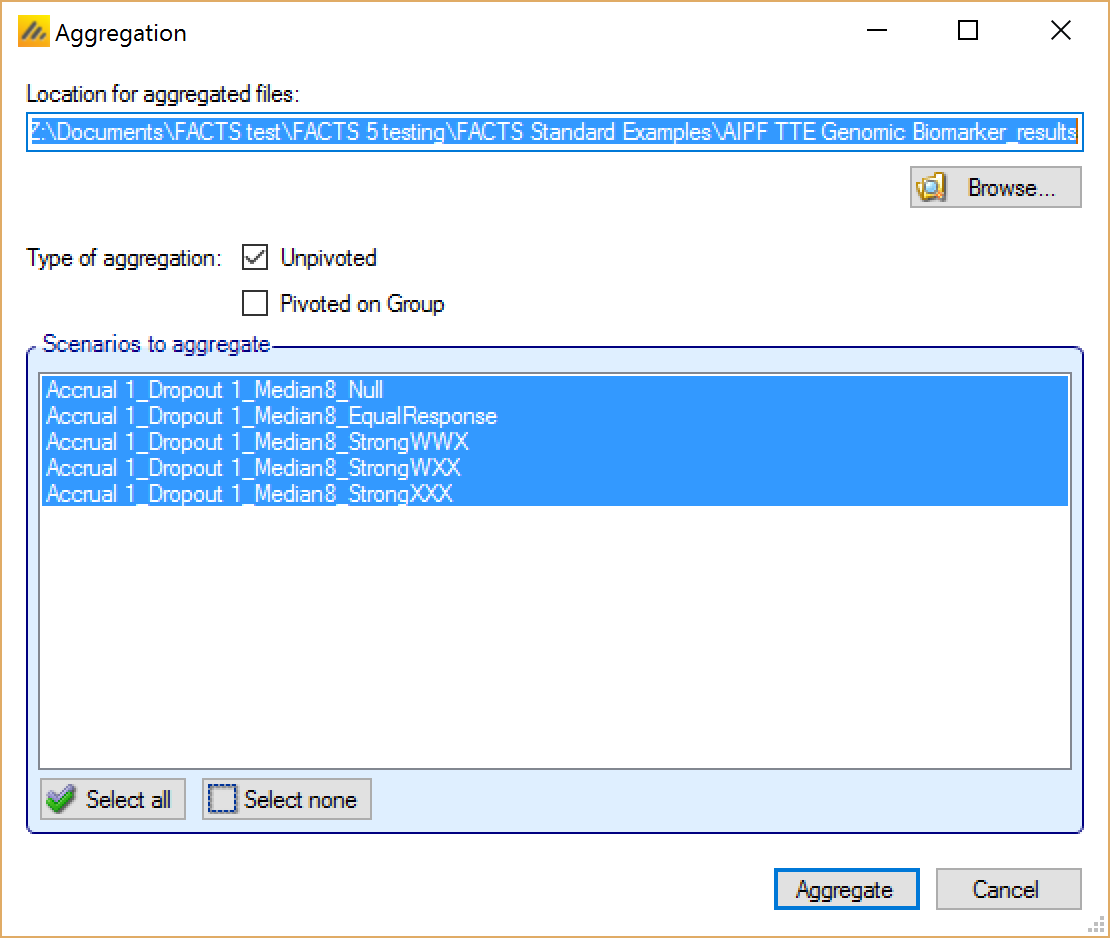
The default location for the aggregated files is the results directory for the study, but this can be changed.
Aggregation may be performed with or without pivoting on group, or both.
Unpivoted files will have one row for each row in the original files.
In pivoted files each original row will be split into one row per group, plus an extra across groups row.
Where there is a group of columns for each group, they will be turned into a single column with each value on a new row.
Values in columns that are independent of group will be repeated on each row.
The default is to aggregate all scenarios, but any combination may be selected.
Pressing “Aggregate” generates the aggregated files.
Each type of csv file is aggregated into a separate csv file whose name begins agg_ or agg_pivot_, so agg_summary.csv will contain the rows from each of the summary.csv files, unpivoted. WeeksNNNNN.csv files are aggregated into a single agg_[pivot_]weeks.csv file. PatientsNNNNN.csv files are aggregated into a single agg_patients.csv file, but they are never pivoted because each row already refers to a single group. Similarly the various frequentist results at the summary, simulation and weeks level are aggregated (if they’ve been output).
RegionIndex.csv is not aggregated.
Each aggregated file begins with the following extra columns, followed by the columns from the original csv file:
| Column Name | Comments |
|---|---|
| Scenario ID | Index of the scenario |
| Recruitment Profile | A series of columns containing the names of the various profiles used to construct the scenario. Columns that are never used are omitted (e.g. External Subjects Profile if there are no external scenarios) |
| Dropouts Profile | |
| Longitudinal Rates Profile | |
| Group Response Profile | |
| External Subjects Profile | |
| Agg Timestamp | Date and time when aggregation was performed |
| P(TS) | Proportion of trial success (early success + late success) |
| P(TF) | Proportion of trial futility (early futility + late futility) |
| Sims | Simulation number. Only present in weeks and patients files. |
| Group | Only present if pivoted |
Design Report
This button becomes enabled once there are simulation results, it uses an R script and R libraries to generate a MS Word document describing the design.
See the FACTS Design Report User Guide for details of what R packages need installing, how FACTS needs configuring to use the correct R instance, how the generate_report() function is run, and where the resulting report can be found.
Graphs of Simulation Results
To enable swift visualization and analysis of the simulation results, FACTS has a number of pre-defined graphs it can display. Full and detailed simulation results are available in ‘csv’ format files that can be loaded into other analysis tools allowing any aspect of the simulation to be explored. These files are described in Section 15, below.
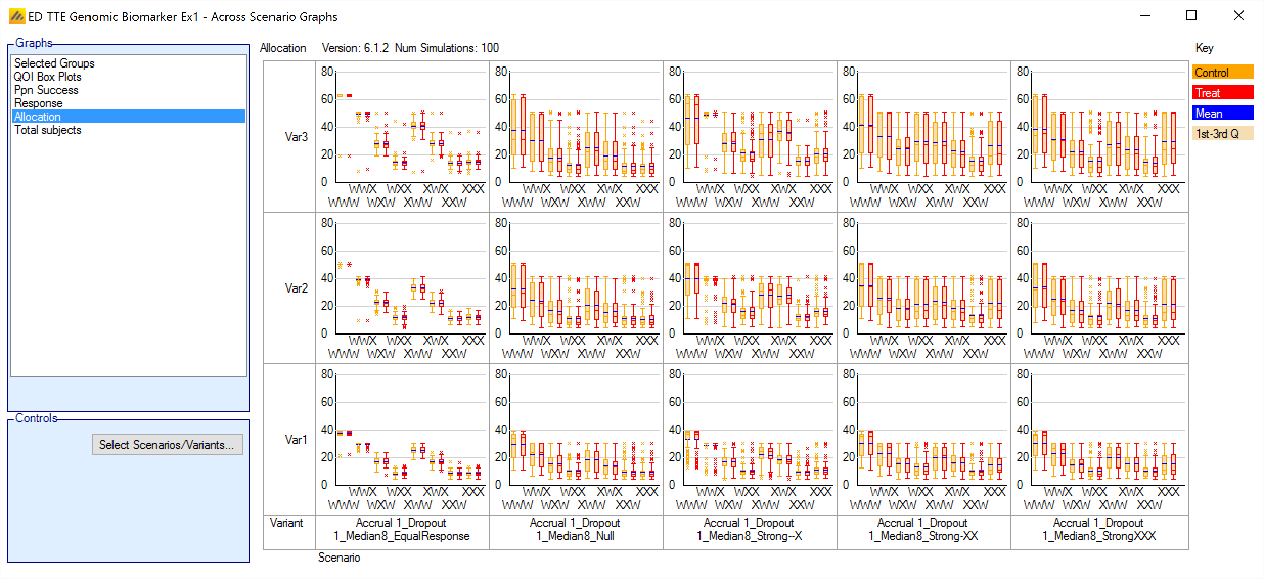
Box and whisker plot conventions
The mean probability is plotted as a large dot.
The median value is plotted as a dashed line.
The 25-75th quantile range is plotted as the “box” portion of each point.
The “whiskers” extend to the largest and smallest values within 1 ½ times the interquartile range from either end of the box.
Points outside the whisker range are considered outliers, and are plotted as small blue dots. Note that it may be difficult to see all of these symbols if they are plotted at the same value.
Per Scenario Graphs
To view the graphs of the results of the simulations of a particular design variant in a particular scenario, select that row of scenario results by clicking on it and then click on the ‘View Graph’ button and select “Show Per Scenario Graphs”.
The graph display supports copying an image of the graph to the clipboard, to facilitate pasting them into documents and presentations. Right clicking on a graph brings up a short menu that allows the image of the graph to be copied to the clipboard or saved in ‘png’ format to a file.
Many graphs have a number of controls to allow the graph to be tailored, standard graph controls available on most graphs are:
Set Y axis – this displays a dialog boxing allowing the user to fix the minimum and maximum of each of the Y axes and the number of ‘tick’ marks. (Not displayed if the ‘y’ value must lie in the interval 0-1.
Group – on some graphs the results show results for the treatment effect in a specific group or across groups, this drop down allows the user to select which.
Simulation – on some graphs the data shown is from a specific simulation, this control allows the user to select which one.
Interim – on some graphs the data shown is from a specific interim in a specific simulation, this control allows the user to select which one.
Outcome and Subject Allocation
Relative Response and Allocation
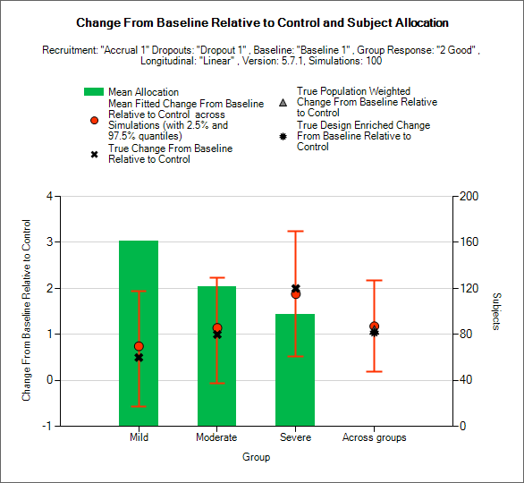
This graph displays a histogram of the mean number of subjects recruited into each group. These plots show:
The mean allocation over all simulations in each group plotted as a green bar.
The true difference in response between the study treatment and control in each group as a black cross.
The estimated mean difference in response (“treatment effect”) and the 2.5-97.5% interquartile range of the observed estimates across the simulations in each group as a red circle with vertical red error bars.
The estimated mean overall difference from the individual control responses and 2.5-97.5% interquartile range of the observed estimates across the simulations across the groups as a red circle with vertical red error bars.
The true population weighted across groups difference in response between the study treatment and control, calculated as the average of the true difference in response in each group weighted by the true population fractions of each group as defined in the actual profile, as a grey triangle.
The true design enriched across groups difference between the study treatment and control, calculated as the average of the true difference in response in each group weighted by the actual numbers of subjects recruited into each group, as a black star.
Response and Allocation
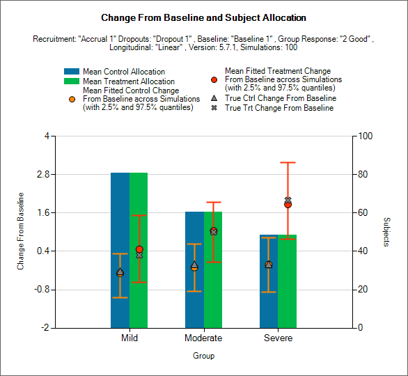
This is similar to the previous graph, except it shows the allocation to, and response on, the study treatment and control arms separately and not the treatment difference.
This graph displays a histogram of the mean number of subjects recruited into each group. These plots show:
The mean allocation over all simulations to control as a blue bar and to the study treatment arm as a green bar.
The true mean response to the study treatment in each group as a black cross.
The true mean response to the control in each group as a black diamond.
The estimated mean response on the study treatment arms and the 2.5-97.5% interquartile range of the observed estimates across the simulations as a red circle with vertical red error bars.
The estimated mean response on the control arms and the 2.5-97.5% interquartile range of the observed estimates across the simulations as a orange circle with vertical orange error bars.
Odds Ratio and Allocation
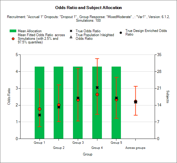
This graph displays a histogram of the mean number of subjects recruited into each group. These plots show:
The mean allocation over all simulations in each group plotted as a green bar.
The true response odds ratio between the study treatment and control in each group as a black cross.
The estimated response odds ratio (“treatment effect”) and the 2.5-97.5% interquartile range of the observed estimates across the simulations in each group as a red circle with vertical red error bars.
The estimated mean overall response odds ratio and 2.5-97.5% interquartile range of the observed estimates across the simulations across the groups as a red circle with vertical red error bars.
The true population weighted across groups response odds ratio between the study treatment and control, calculated as the average of the true odds ratio in each group weighted by the true population fractions of each group as defined in the actual profile, as a grey triangle.
The true design enriched across groups odds ratio between the study treatment and control, calculated as the average of the true odds ratio in each group weighted by the actual numbers of subjects recruited into each group, as a black star.
Response and Allocation
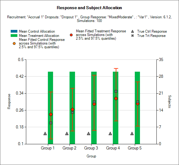
This is similar to the previous graph, except it shows the response rate on the study treatment and control arms separately and not the odds ratio.
This graph displays a histogram of the mean number of subjects recruited into each group. These plots show:
The mean allocation over all simulations to control as a blue bar and to the study treatment arm as a green bar.
The true mean response rate for the study treatment in each group as a black cross.
The true mean response rate for the control in each group as a blue triangle.
The estimated mean response rate on the study treatment arms and the 2.5-97.5% interquartile range of the observed estimates across the simulations as a red circle with vertical red error bars.
The estimated mean response rate on the control arms and the 2.5-97.5% interquartile range of the observed estimates across the simulations as an orange circle with vertical orange error bars.
Hazard Ratio and Allocation
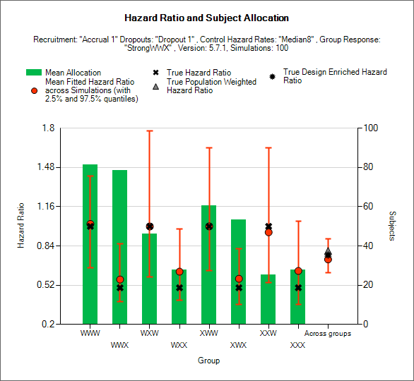
This graph displays a histogram of the mean number of subjects recruited into each group. These plots show:
The mean allocation over all simulations in each group plotted as a green bar.
The true hazard ratio between the study treatment and control in each group as a black cross.
The estimated hazard ratio (“treatment effect”) and the 2.5-97.5% interquartile range of the observed estimates across the simulations in each group as a red circle with vertical red error bars.
The estimated mean overall hazard ratio and 2.5-97.5% interquartile range of the observed estimates across the simulations across the groups as a red circle with vertical red error bars.
The true population weighted across groups hazard odds ratio between the study treatment and control, calculated as the average of the true hazard ratio in each group weighted by the true population fractions of each group as defined in the actual profile, as a grey triangle.
The true design enriched across groups hazard ratio between the study treatment and control, calculated as the average of the true hazard ratio in each group weighted by the actual numbers of subjects recruited into each group, as a black star.
Hazard Rates
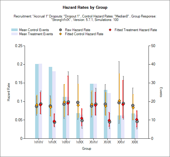
The Hazard Rates graphs shows the number of events in each arm, the raw hazard ratio and fitted hazard ratios.
The blue show the number of events in the control arm.
The gray bar shows the number of events in the treatment arm.
The raw hazard ratio in each arm is shown by a gray circle.
The fitted hazard ratio in the control arm is shown by an orange diamond with orange bars indicating the 2.5-97.5% interquartile range.
The fitted hazard ratio in the treatment arm is shown by a red diamond, with red bars indicating the 2.5-97.5% interquartile range.
Prob. Group Compared to CSD/CSHRD Futility
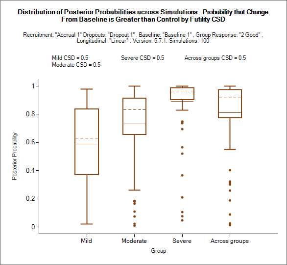
This graph shows for each group and the across groups analysis, the probability of ‘beating’ the CSD for futility (the definition of ‘beating’ will depend on whether a higher endpoint score is a better or worse outcome for the subject and whether the trial is for superiority or non-inferiority).
Note that though This is the comparison against the Futility CSD it is the probability of being better than it, higher probabilities mean less likelihood of stopping early for futility or declaring futility in the final evaluation.
The mean probability is plotted as solid line.
The median value is plotted as a dashed line.
The 25-75th quantile range is plotted as the “box” portion of each point.
The “whiskers” extend to the largest and smallest values within 1 ½ times the interquartile range from either end of the box.
Points outside the whisker range are considered outliers, and are plotted as small blue dots. Note that it may be difficult to see all of these symbols if they are plotted at the same value.
This graph shows for each group and the across groups analysis, the probability of ‘beating’ the CSD for futility (the definition of ‘beating’ will depend on whether a higher endpoint score is a better or worse outcome for the subject and whether the trial is for superiority or non-inferiority).
Note that though this is the comparison against the Futility CSD it is the probability of being better than it, higher probabilities mean less likelihood of stopping early for futility or declaring futility in the final evaluation.
The mean probability is plotted as a solid line.
The median value is plotted as a dashed line.
The 25-75th quantile range is plotted as the “box” portion of each point.
The “whiskers” extend to the largest and smallest values within 1 ½ times the interquartile range from either end of the box.
Points outside the whisker range are considered outliers, and are plotted as small blue dots. Note that it may be difficult to see all of these symbols if they are plotted at the same value.

This graph shows for each group and the across groups analysis, the probability of ‘beating’ the CSHRD for futility (the definition of ‘beating’ will depend on whether a higher endpoint score is a better or worse outcome for the subject and whether the trial is for superiority or non-inferiority).
Note that though this is the comparison against the Futility CSHRD it is the probability of being better than it, higher probabilities mean less likelihood of stopping early for futility or declaring futility in the final evaluation.
The mean probability is plotted as a solid line.
The median value is plotted as a dashed line.
The 25-75th quantile range is plotted as the “box” portion of each point.
The “whiskers” extend to the largest and smallest values within 1 ½ times the interquartile range from either end of the box.
Points outside the whisker range are considered outliers, and are plotted as small blue dots. Note that it may be difficult to see all of these symbols if they are plotted at the same value.
Prob. Group Compared to CSD/CSHRD Success and Group Phase III Success
This is the same as the “Prob. Group Compared to CSD/CSHRD Futility” plot, except that the probabilities are either
Relative to control and the CSHRD for success.
The probability of Phase III success
Trial Outcomes by Group
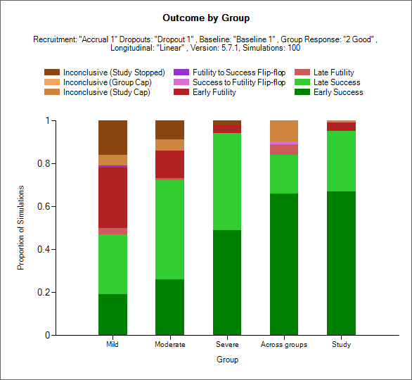
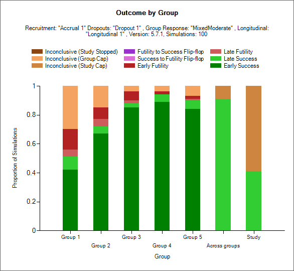
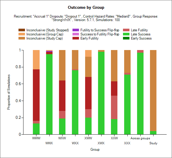
This plot shows as a stacked bar chart the proportion of different outcomes by group, across group and whole study.
The outcome types are:
Early Success (dark green): the group stopped early for success and had not regressed to futile (but it could have regressed to inconclusive) at the final analysis (if there was one).
Late Success (light green): the group recruitment stopped because the group or study recruitment cap was reached; in the final evaluation of the group data the final evaluation success criteria were met.
Late Futility (light red): the group recruitment stopped because the group or study recruitment cap was reached; in the final evaluation of the group data the final evaluation futility criteria were met.
Early Futility (dark red): the group stopped early for futility and had not regressed to success (but it could have regressed to inconclusive) at the final analysis (if there was one).
Success to Futility Flip-Flop (pink): the group stopped early for success but had regressed to futility at the final analysis.
Futility to Success Flip-Flop (purple): the group stopped early for futility but had regressed to success at the final analysis.
Inconclusive - Study Cap (dark brown): the group recruitment stopped because the study recruitment cap was reached; in the final evaluation of the group data neither the final evaluation success not the final evaluation futility criteria were met.
Inconclusive – Group Cap (light brown): the group recruitment stopped because the group recruitment cap was reached; in the final evaluation of the group data neither the final evaluation success not the final evaluation futility criteria were met.
Outcome by Scatterplot
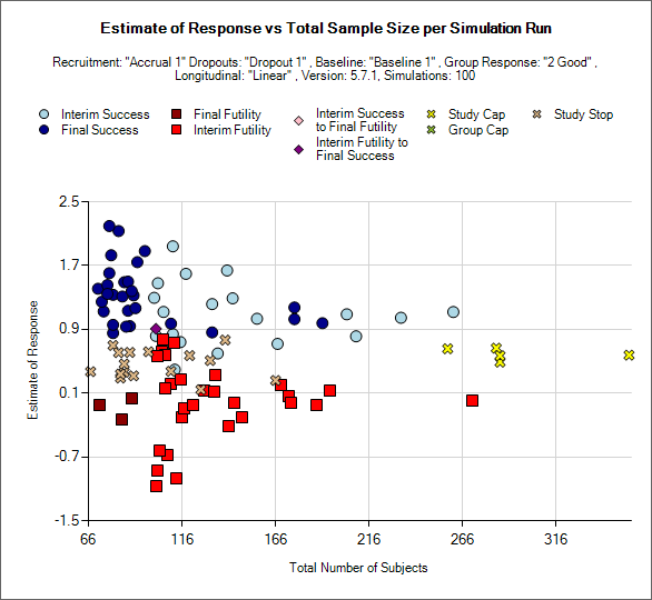
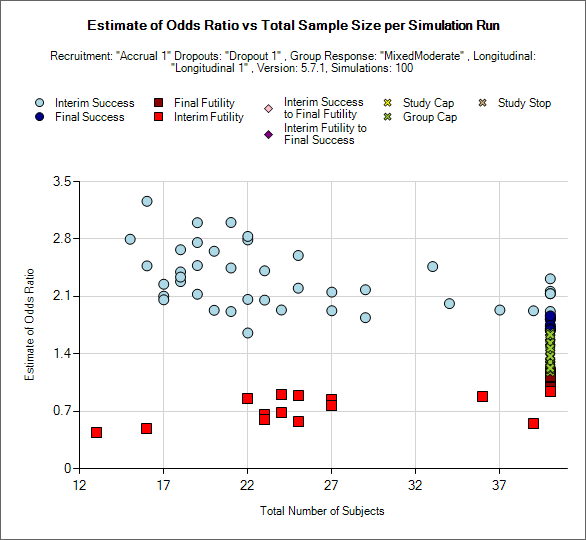
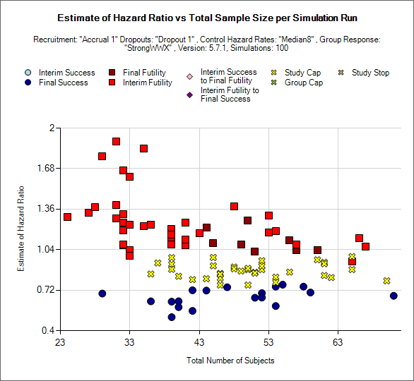
This is a scatter plot graph that plots the result of a particular group or the ‘across groups’ plotting the estimate of response against the number of subjects recruited into the group or whole trial.
The symbol used to plot each simulation indicates the reason for stopping / outcome.
Light blue circle: the group stopped early for success
Dark blue circle: the group did not stop early and was a success in the final analysis
Brown square: the group did not stop early and the was futile in the final analysis
Red square: the group stopped early for futility
Light pink diamond: the group stopped early for success but was futile in the final analysis.
Brown diamond: the group stopped early for futility but was successful in the final analysis
Yellow cross: the group outcome was inconclusive; the study reached the study cap.
Blue cross: the group outcome was inconclusive; the group reached the group cap.
Pink cross: the group outcome was inconclusive; the study stopped early.
There is a control that allows the user to select whether the points are plotted for a particular group or for the whole study – using the across groups treatment estimate.
Distribution of Early Stopping (Futility)
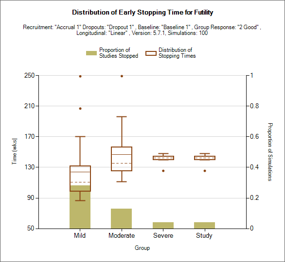
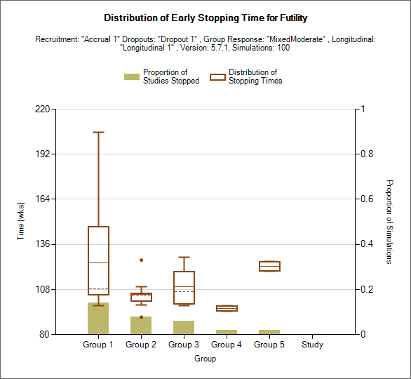
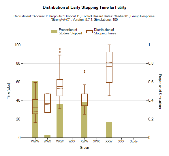
This plot shows the proportion of times each group has stopped early for futility as a brown bar, plus box and whisker plots showing the distribution, in time in weeks, of when those early stops occurred.
Distribution of Early Stopping (Success)
This plot is the same as for the “Distribution of Early Stopping (Futility)” plot, except it shows the proportion of times each group has stopped early for success and the distribution in stopping times of those stops.
Cumulative Operating Characteristics Plot

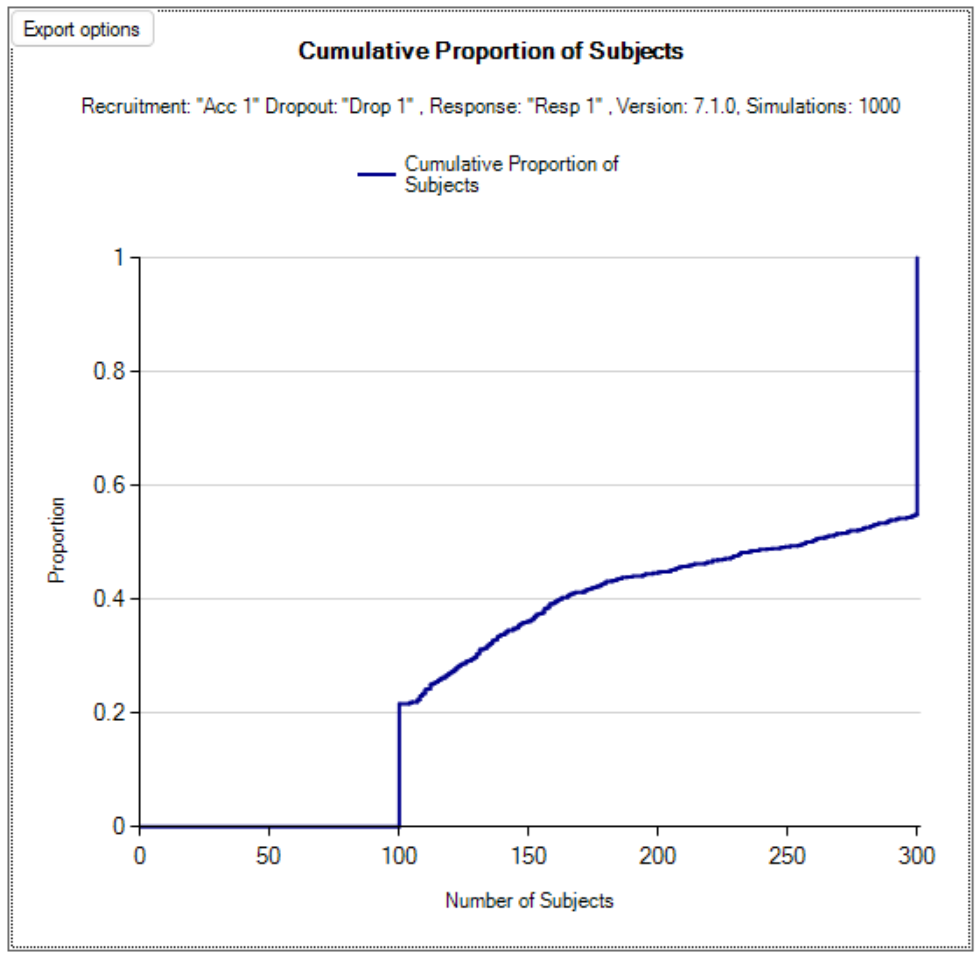
There are two graphs, one that shows the cumulative proportion of durations across all simulations, and the other shows the cumulative proportion of subjects across all simulations.
Per Sim and Interim Relative Response and Allocation
These graphs exclusive to continuous and dichotomous endpoint designs show similar information to the Relative Response and Allocation graph above, but show the results for a single simulation, or single interim of a single simulation. The individual interim results can only be shown for simulations for which ‘weeks’ files were output.
Per Sim and Interim Relative Response and Allocation
These graphs show similar information to the Outcome and Allocation graph above, but show the results for a single simulation, or single interim of a single simulation. The individual interim results can only be shown for simulations for which ‘weeks’ files were output.
Explore Final Futility/Success Criteria
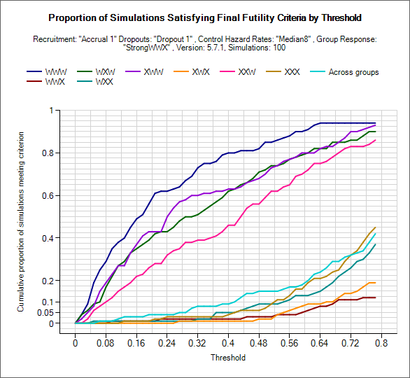
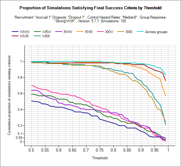
These graphs can be used to explore what proportion of simulated trials of a particular scenario would have been a success/failure at final evaluation. Using the two drop down controls the user can select criteria to use: posterior probability of beating the CSD/CSHRD or probability of phase III success, and set and lower/upper limits to explore for the threshold (setting the range used on the x-axis).
For the given target the proportion of trials that would meet each of the criteria over the range of threshold values is plotted for each group and across group treatment effects.
As in the examples above, the plots will be somewhat jagged if only a small number of simulations have been run. These graphs can be used to select thresholds that can be expected to yield a certain level of type-1 or power, but the user must remember these will only be approximate (depending on the number of simulations) but can be useful to understand the designs sensitivity to the thresholds and to set initial thresholds early on in the design / simulation process that will get close to the desired type-1 error and power from the outset.
Explore Early Success/Futility Eval Criteria
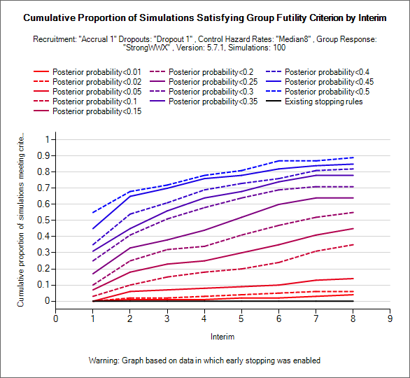
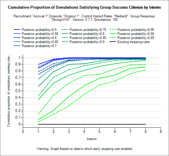
These graphs can be used to explore what proportion of simulated trials of a particular scenario would have stopped early for success/futility. NOTE these graphs require weeks files to have been output, they are also most use where the design has been simulated with interims but no early stopping (as in the examples above where the shape of the “existing stopping rules” line indicates that no early stopping occurred in these simulations).
Using the two drop down controls, the user can select which stopping criteria is evaluated and from which interim stopping will be permitted. Lines are then displayed for the proportion of simulations that would have stopped by each interim for a fixed set of thresholds.
Typically these can be used to see at what threshold (and starting at what interim) stopping for success or futility introduces an unacceptably level of ‘incorrect’ early stopping – stopping for futility in successful scenarios and stopping for success in futile scenarios and whether at below/above these levels there may be a useful probability of correct stopping.
MCMC Trace plots
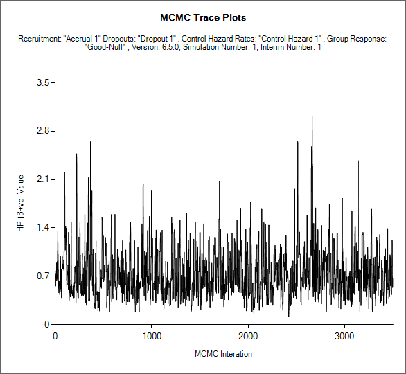
If an MCMC sample file has been output for one or more simulations (the default is to not output MCMC sample files due to their size), then for each of those simulations it is possible to view the MCMC trace of the sampled values for each of the parameters sampled in the MCMC. (See the description of the MCMC file contents below 16.6).
If the design is adaptive, the user can select which interim (“update”) the samples are from, as well as which parameter’s samples to plot.
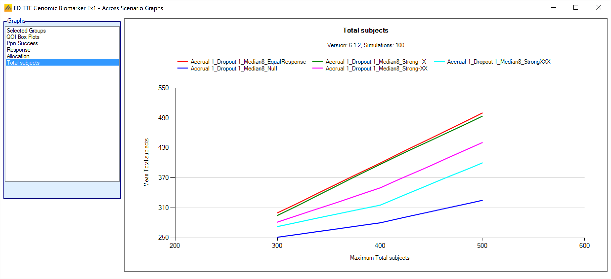
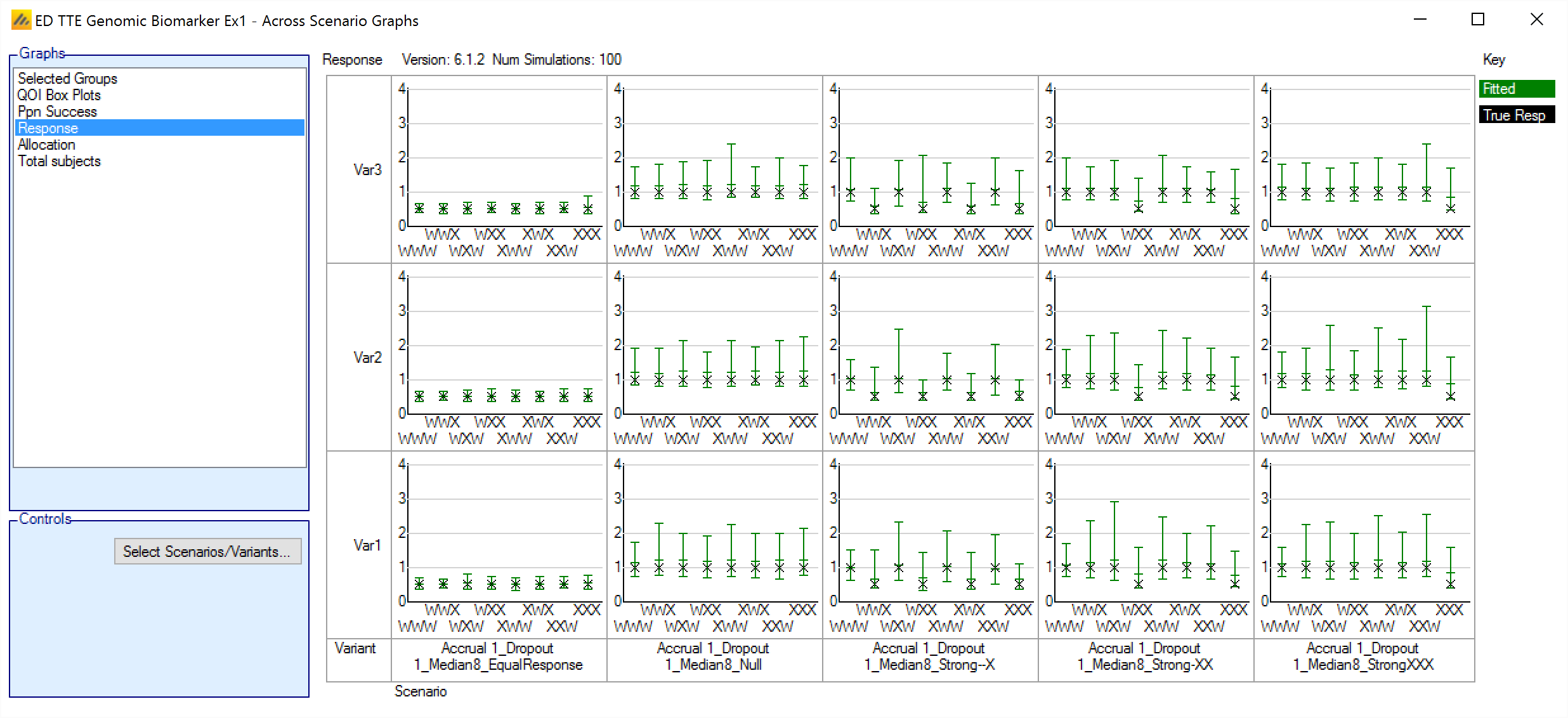
Across Scenario Graphs
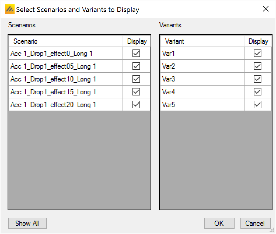
To view multiple graphs showing the results of the simulations of possibly all the design variants and all the scenarios click on the ‘View Graph’ button and select “Show Across Scenario Graphs”. This launches a graph display that displays multiple graphs in a trellis plot. You can select the graph type, filter the design variants and filter which scenarios displayed:
Selected Groups
This graph shows a bar chart for each scenario and variant selected. Each chart shows how often each group was successful in a trial that was successful.
“Successful” –the arm was correctly successful: it was successful, marked as “Should succeed” on the VSR tab and the trial was successful.
“Should not succeed” – the arm was incorrectly successful: it was successful but not marked as “Should succeed” on the VSR tab and the trial was successful.
Unsuccessful – the trial was successful but the group was not.
QOI Box Plots
This graph shows a box and whisker plot for each scenario and variant selected. Each plot shows the distribution of the values of a selected QOI for each group. There is a dropdown control to allow the selection of the QOI to be displayed. Any Posterior probability, Predictive probability, p-value or target QOI can be selected.
Ppn Success
This grouped bar chart shows a bar for the proportion of successful simulations for each variant, grouped by scenario.
Response
This graph shows a group response plot for each scenario and variant selected. Each plot shows the mean estimate over the simulations and the 95%-ile interval of the mean estimates over the simulations. The graph also shoes the “true response” i.e. the mean response being simulated.
Allocation
This graph shows a box and whisker plot for each scenario and variant selected. Each plot shows the distribution of the number of subjects allocated to each arm in each group over the simulations.
Total Subjects
This graph shows the mean total sample size for each scenario at different maximum sample sizes (the different variants).